MORPHEUS VR USER PLATFORM
BY CHARLIE HENRY
Project Objective: Designing through UI/UX for a VR user platform, I embarked on a transformative journey to elevate the user experience to new heights. Starting from the ground up, I reimagined the principles of UI and UX, placing the user at the center of every design decision. The result? A seamless and immersive platform that leaves a lasting impression.

The user platform began with a revamped onboarding process, which saw a staggering 100% increase in engagement. By incorporating intuitive interactions, seamless navigation, and captivating 3D technology, users were enthralled as they traveled between virtual places, attended events, and even personalized their avatars. The integration of AI assistants further enhanced the experience, providing intelligent guidance and support.

I led the creation of a comprehensive set of elements and asset libraries. This included a wide range of UI components, custom iconography, carefully selected typography, 3D models and assets, captivating visual effects, a curated colour palette, engaging animations and motion design, as well as VR interaction guidelines. These elements and assets were meticulously designed to ensure visual coherence, enhance immersion, and deliver a compelling and unforgettable user experience within the VR environment.
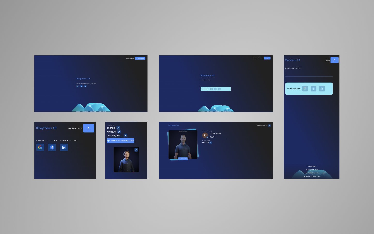
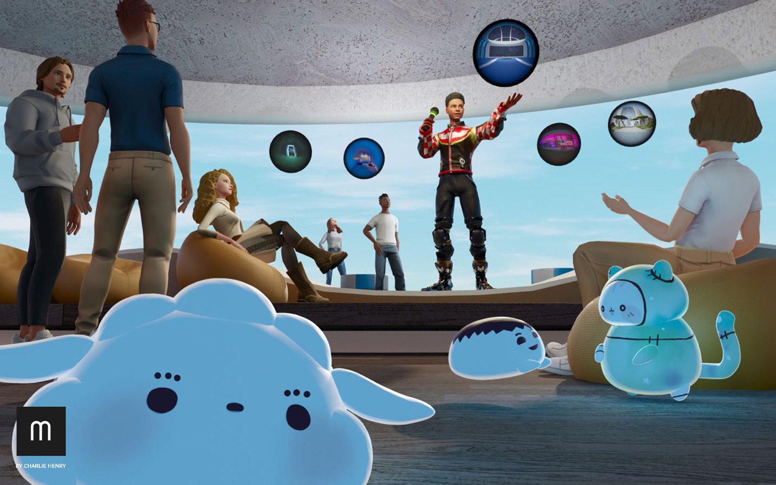
Past User Platform UI/UX Morpheus XR
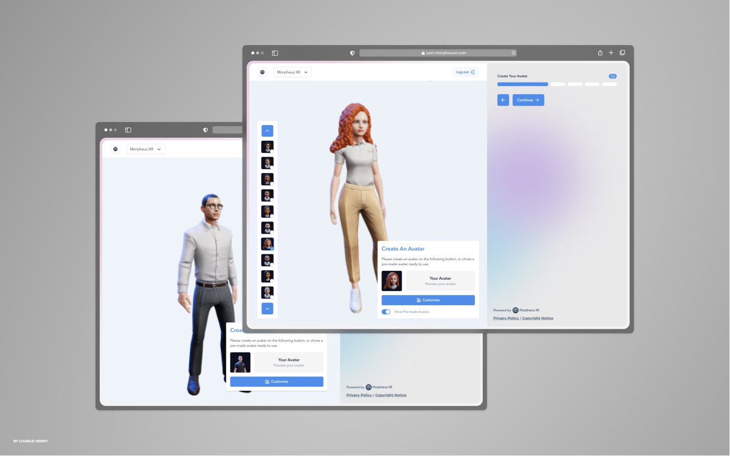
New User Center & User Friendly System

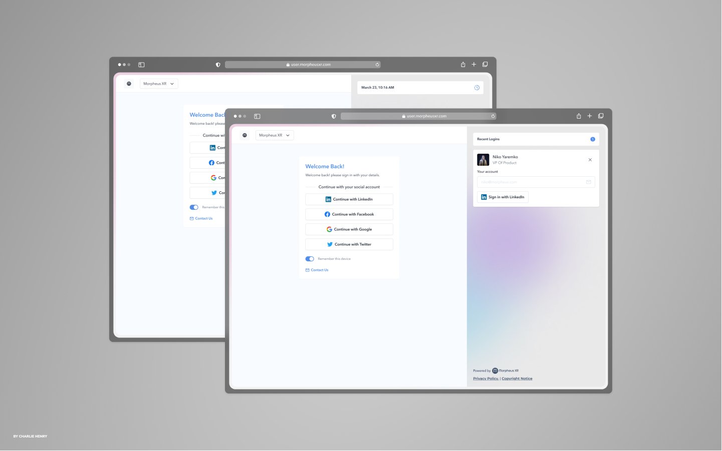
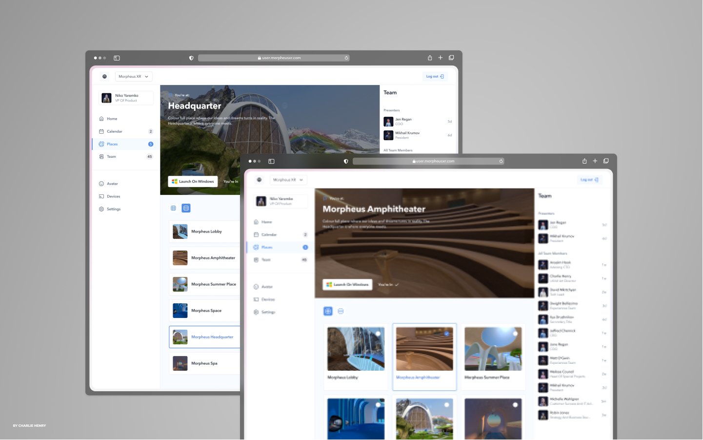
The platform seamlessly extended beyond VR, integrating with the web to provide a cohesive user experience across devices. Users could effortlessly check the latest news, tweak settings, personalize their environment, monitor attendance, and collaborate with team members. The engagement levels soared as the platform fulfilled its goals of captivating users and fostering a sense of community.

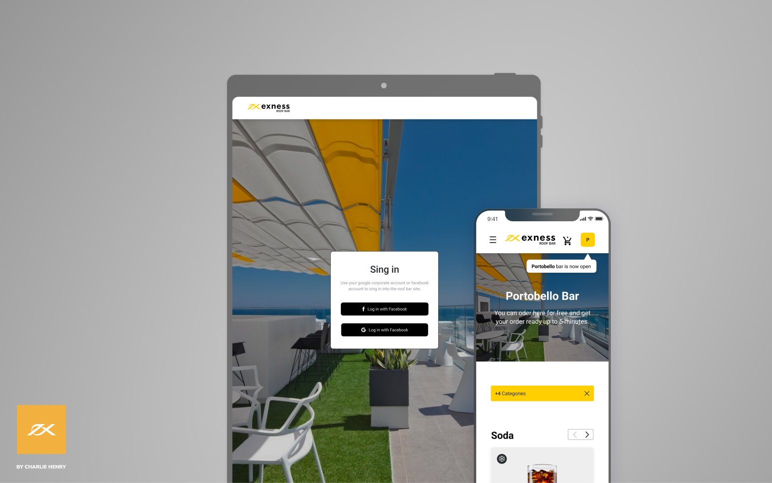
For the web platform, a responsive design approach was implemented to ensure that users could access and interact with the platform seamlessly from desktop computers, laptops, tablets, and mobile devices. The user interface and layout were carefully designed and developed to dynamically adjust and reflow based on the screen size and resolution of the device being used.
Responsive web design techniques, such as fluid grids, flexible images, and media queries, were utilized to ensure that the platform's content and components would adapt and fit appropriately on different screen sizes. This allowed users to have a consistent and user-friendly experience, whether they were accessing the platform from a large desktop monitor or a small smartphone screen.


UX User Research
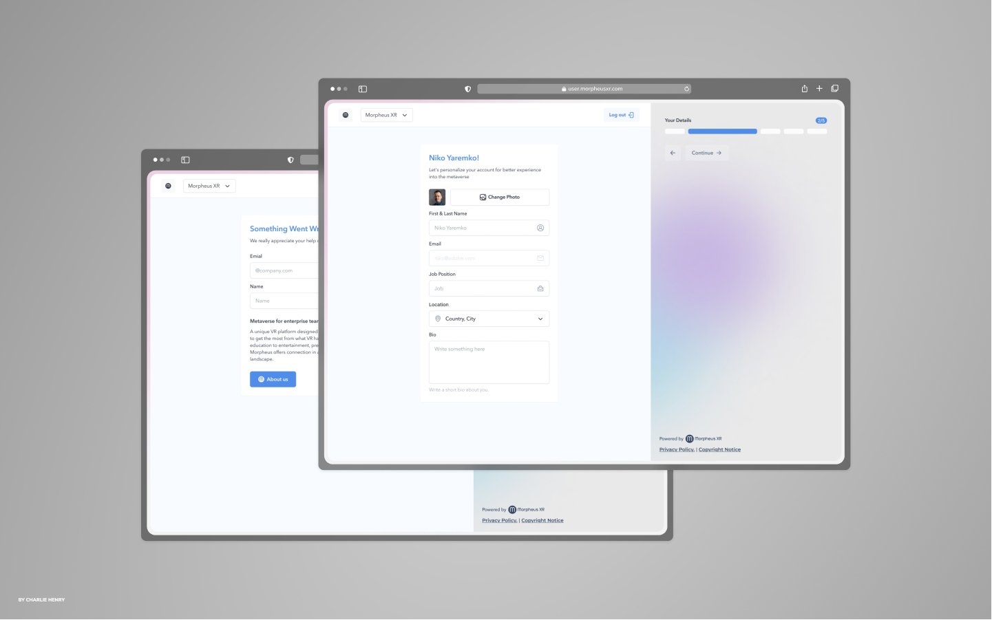
The user research findings played a critical role in informing the design decisions throughout the development process. By understanding user needs, pain points, and preferences, the UI/UX of the VR user platform was carefully tailored to create a user-centric experience that addressed user expectations and maximized engagement.

The user flow within the VR user platform was carefully crafted to provide a seamless and intuitive experience. From the onboarding process to virtual environment exploration, attending events, avatar customization, integration with 3D technology, AI assistant integration, accessing news and updates, personalization settings, and facilitating collaboration and teamwork, each stage was designed to ensure a smooth and engaging user journey. The platform aimed to empower users to navigate, interact, and personalize their VR experience effortlessly, fostering a sense of immersion and enjoyment.

UI User Interface Flow
The UI design for the web and VR versions of the platform was approached with careful consideration for the unique characteristics and user experiences of each environment.

For the web UI, a user-centric design approach was followed to create an intuitive and visually appealing interface. The layout was designed to be clean, organized, and responsive, ensuring that users could easily navigate, access features, and interact with the platform's functionalities. The typography, color scheme, and visual elements were chosen to provide a cohesive and engaging user experience across different devices. The web UI prioritized accessibility, ensuring that all users could interact with the platform comfortably, regardless of their device or any physical limitations.
Both the web and VR UI designs maintained consistency in branding, color palette, and overall visual language to ensure a cohesive user experience across platforms. However, the specific interface elements, interaction patterns, and design principles were tailored to the characteristics and affordances of each platform.

The user experience (UX) of the platform was designed to be intuitive and immersive, catering to user needs and preferences. It provided seamless navigation, clear visual cues, and consistent design patterns.
The UI environment offered a high level of immersion through realistic 3D visuals and interactive elements. Users could personalize their experience, and accessibility considerations were incorporated. Immediate feedback and streamlined processes ensured a smooth and satisfying interaction. The aim was to exceed user expectations, foster engagement, and create a memorable experience.


Mobile
The mobile version of the platform was thoughtfully designed to deliver a seamless and optimized user experience on smartphones and tablets. It incorporated responsive design techniques to ensure that the platform adapted smoothly to different screen sizes and resolutions.
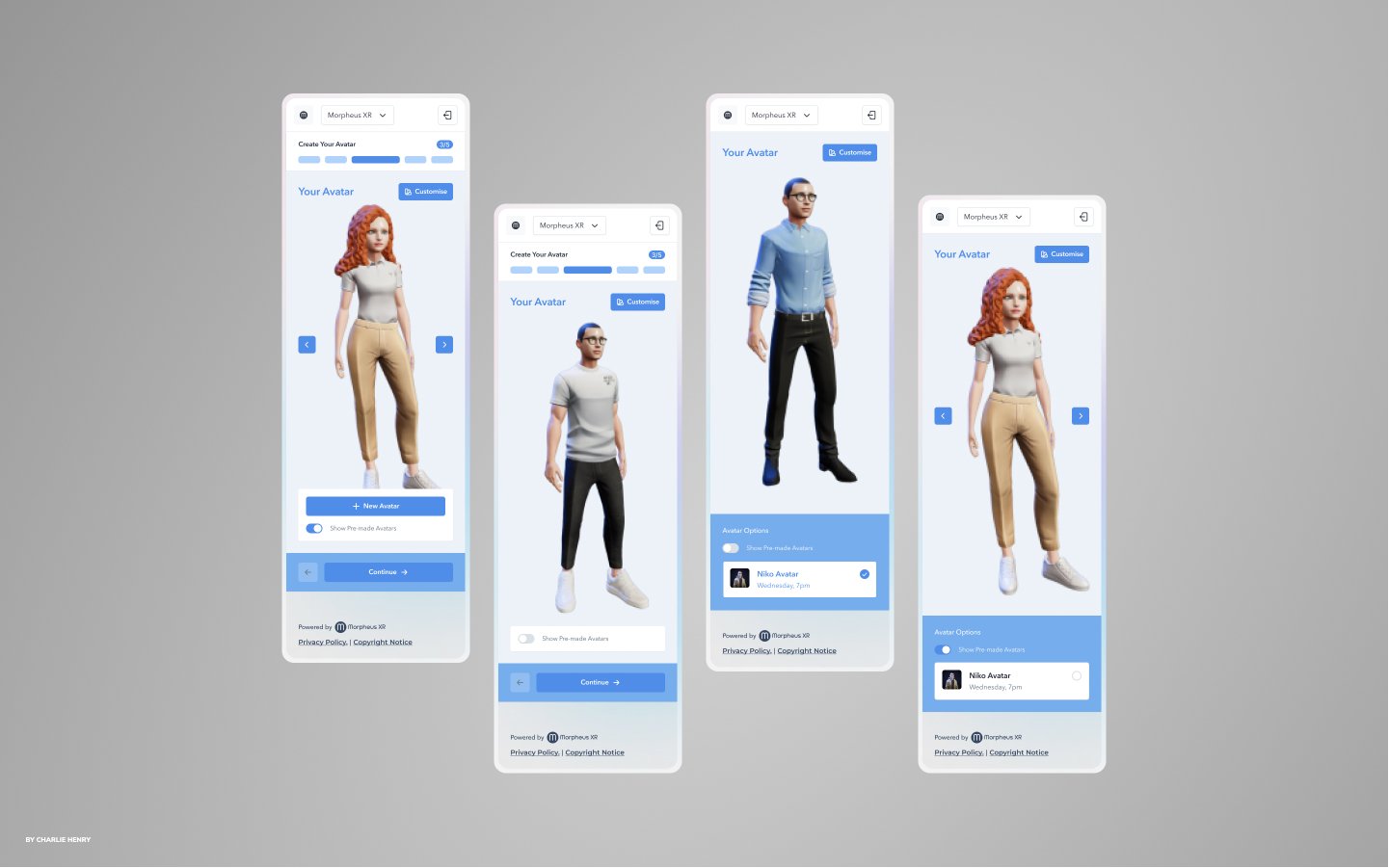

The interface elements, such as buttons, menus, and input fields, were tailored for mobile interactions, making them easily tappable and spaced out to avoid accidental touches. The overall navigation was streamlined and intuitive, providing a user-friendly experience on mobile devices. The mobile version maintained consistency with the web and VR versions, ensuring a cohesive experience across platforms.


The platform was carefully designed with a responsive interface, streamlined navigation, and optimal usability for smartphones and tablets. It offered a consistent and user-friendly experience, ensuring seamless access to the platform's features and functionalities across different mobile devices.